Example generated reports
The same question, answered by each tool
Both outputs below cover monthly revenue and profit for your company's Sales Plan. One was generated by Claude on the mirrored data; the other by Power BI Copilot. They are shown as produced, so you can judge the results side by side.
Generated by Claude
MCP + Project
A branded, explained report on live data
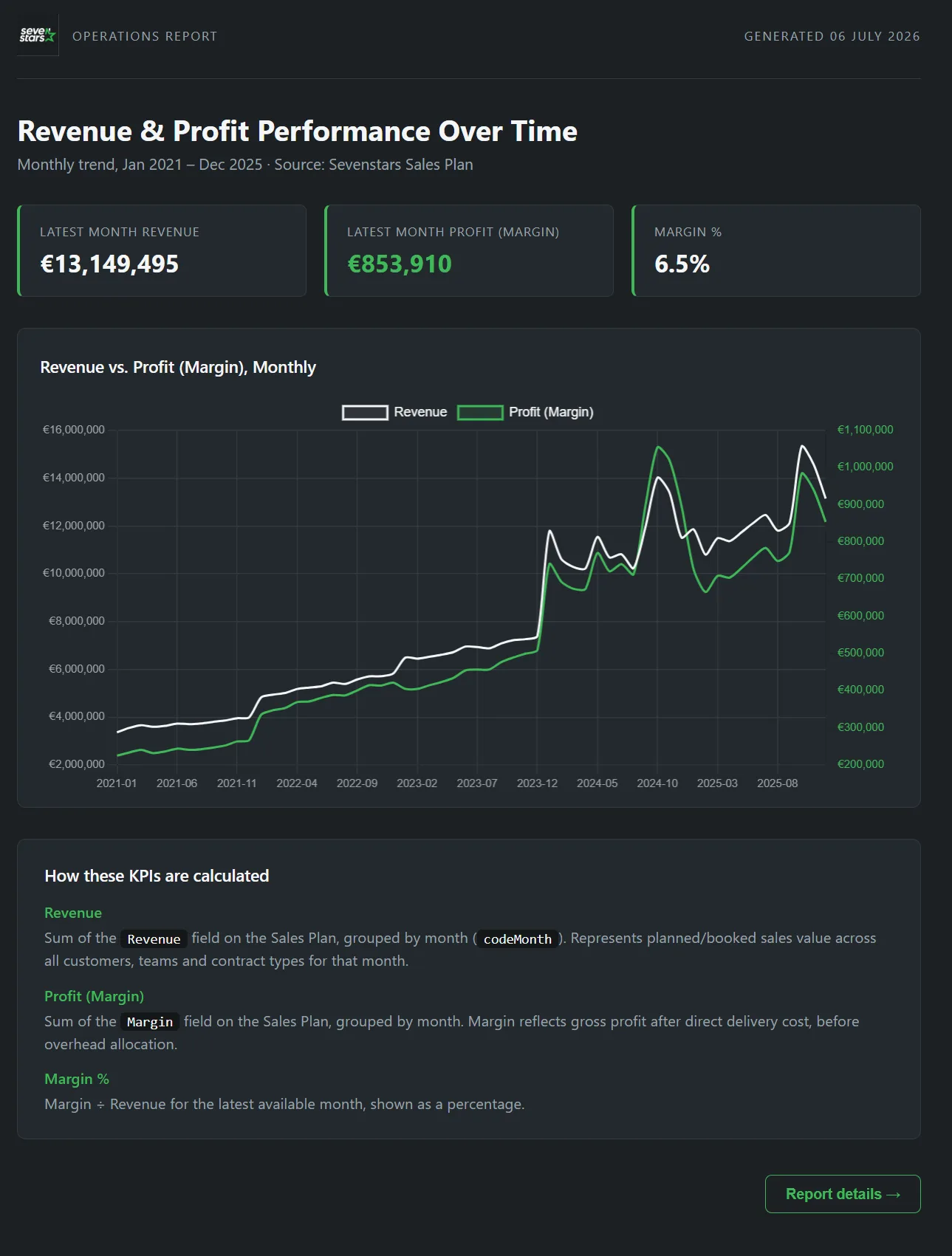
Claude queried the mirrored tables directly and returned a self-contained report, KPIs, a revenue-vs-profit trend, and a plain-language note on how each figure is calculated, built to the brief in one pass.
Generated by Power BI Copilot
Fabric / semantic model
An interactive dashboard on the semantic model
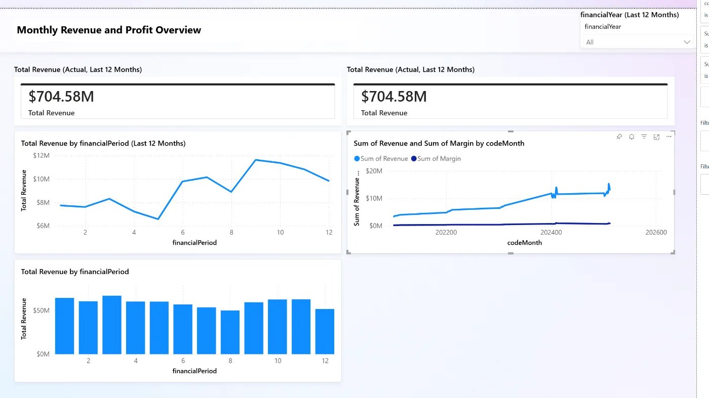
Power BI Copilot assembled visuals on top of the modeled dataset: revenue cards, trend lines and a period breakdown with a year slicer. Interactive and filterable, but dependent on the semantic model built beforehand.
Want the full trade-off, cost, scale, governance and more, behind these two outputs?
Compare the options